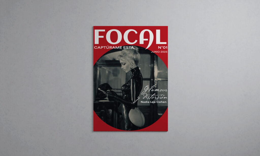
I created Focal as an independent editorial design project to look at how photography, art, and design connect in our culture. Inspired by alternative magazines like Dazed, Foam, and Purple, the goal was to build a clean layout that gives proper space to critical photographers, visual essays, and honest interviews.
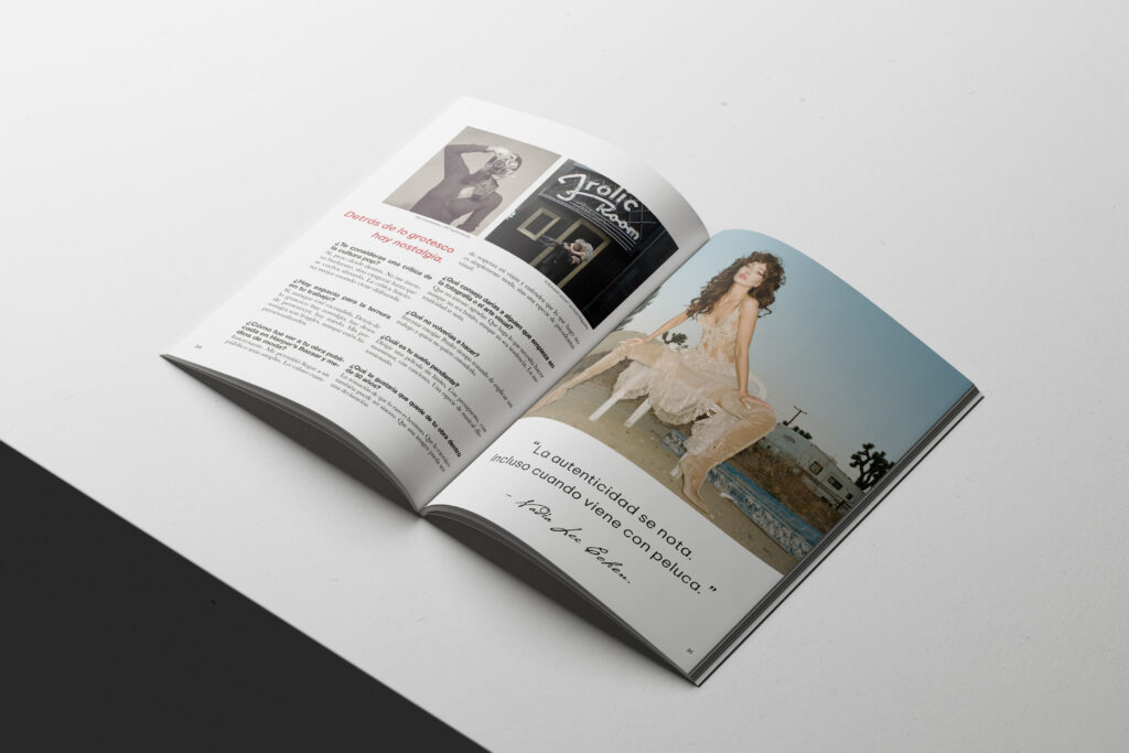
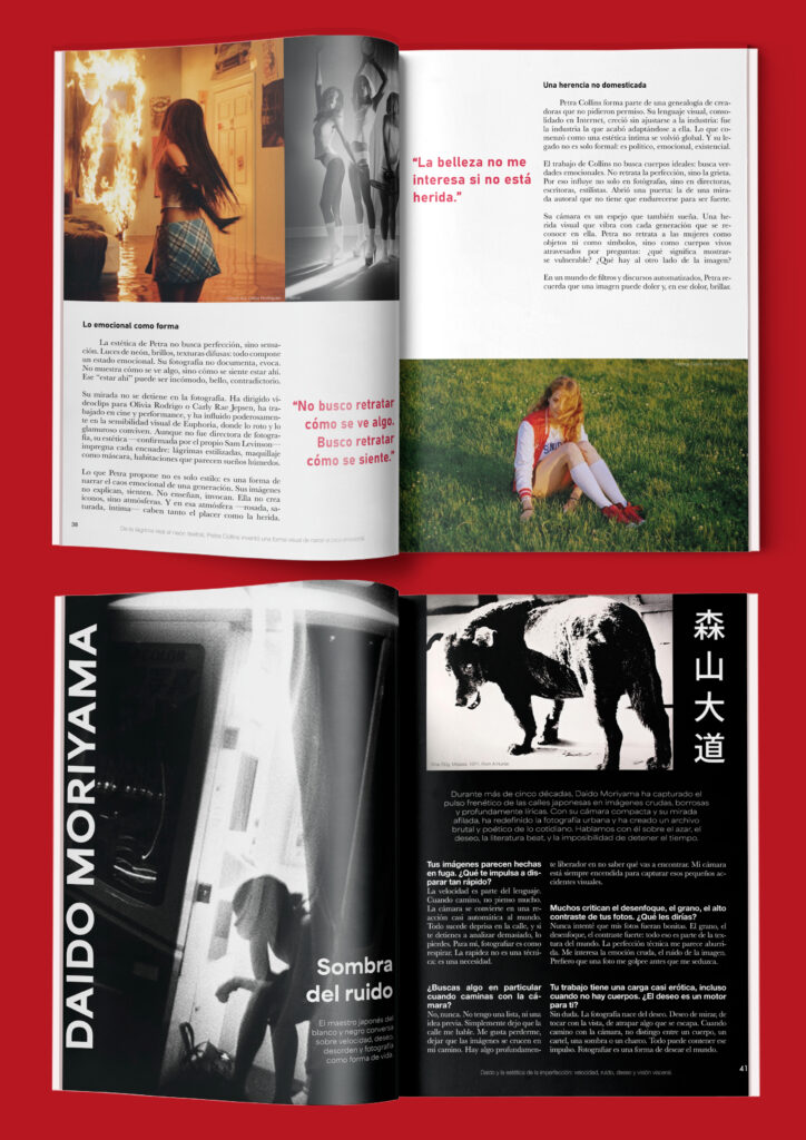
The visual design relies on a bold red, black and white color palette. Throughout the pages, I used circular shapes to reference a camera lens and photographic framing. For the typography, I mixed strong geometric fonts like Futura for the headings with classic, easy-to-read fonts like Helvetica Neue and Baskerville for the text. Everything is laid out on a flexible grid, but I occasionally let the titles and quotes break past the margins to keep the pages dynamic and stop the design from feeling too rigid.
Across its 56 pages, this first issue features incredible creatives who use photography to challenge ideas about the world. The pages cover everything from the raw, political imagery of Ren Hang and the pop styling of David LaChapelle, to feature spreads on Cindy Sherman, Zanele Muholi, and Nadia Lee Cohen. Ultimately, this project allowed me to experiment with pacing, grid structures, and typography to create a cohesive piece of print design.