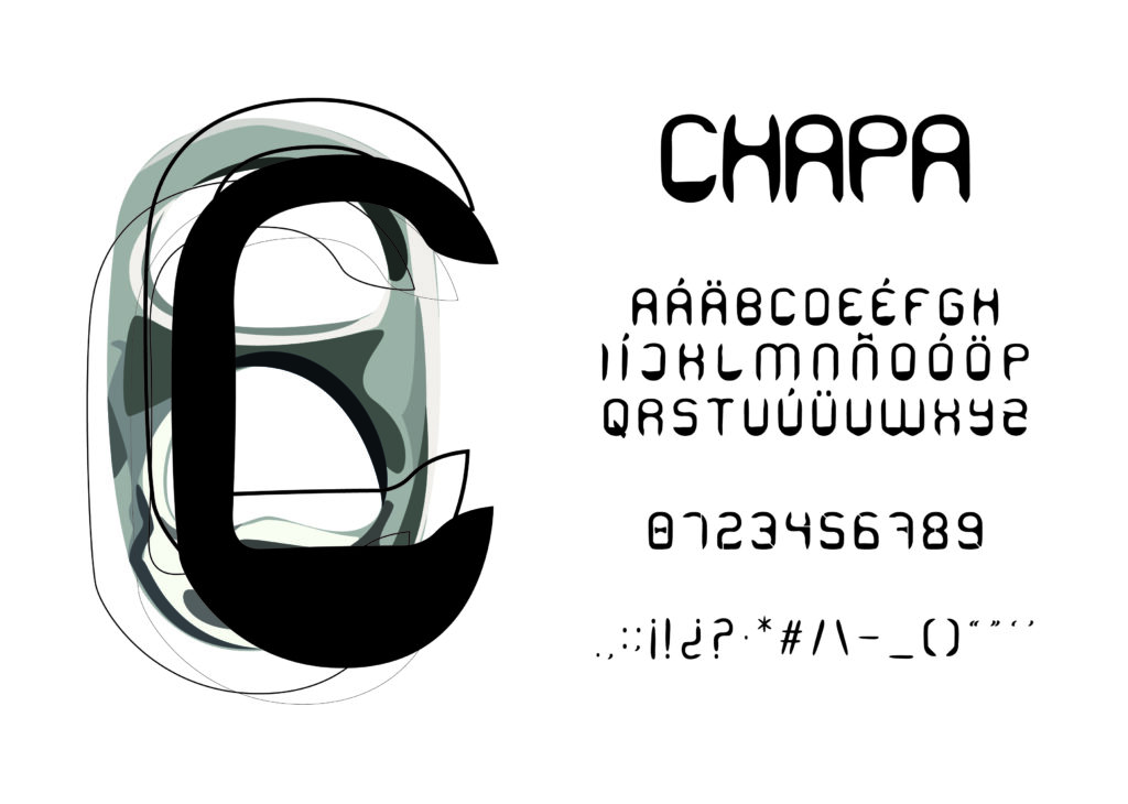
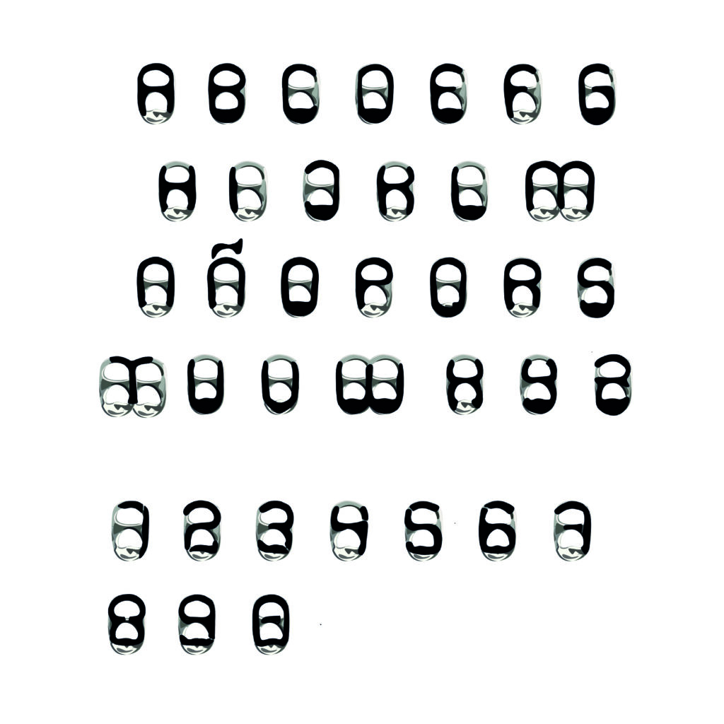
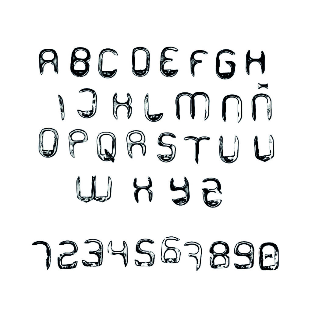
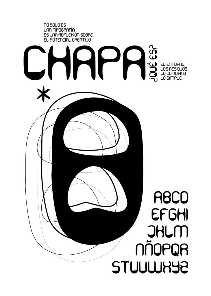
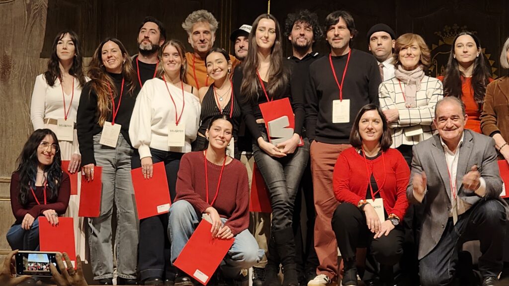
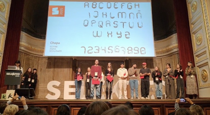
Chapa is an Award-winning Work at Selekted Design Awards for New Talents. A typeface inspired by an everyday material: the metal lids from drinks cans. We often overlook them, but upon closer inspection, I was struck by their shape, their durability and their texture. From there, the idea emerged: to transform this common waste into a tool for visual communication.
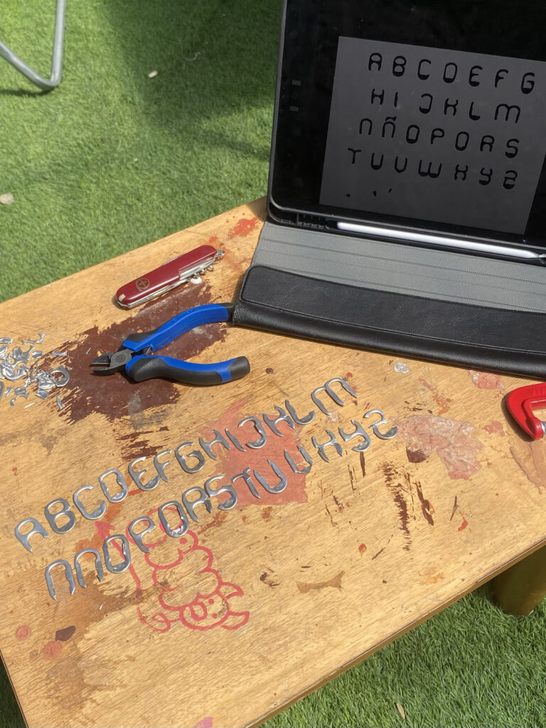
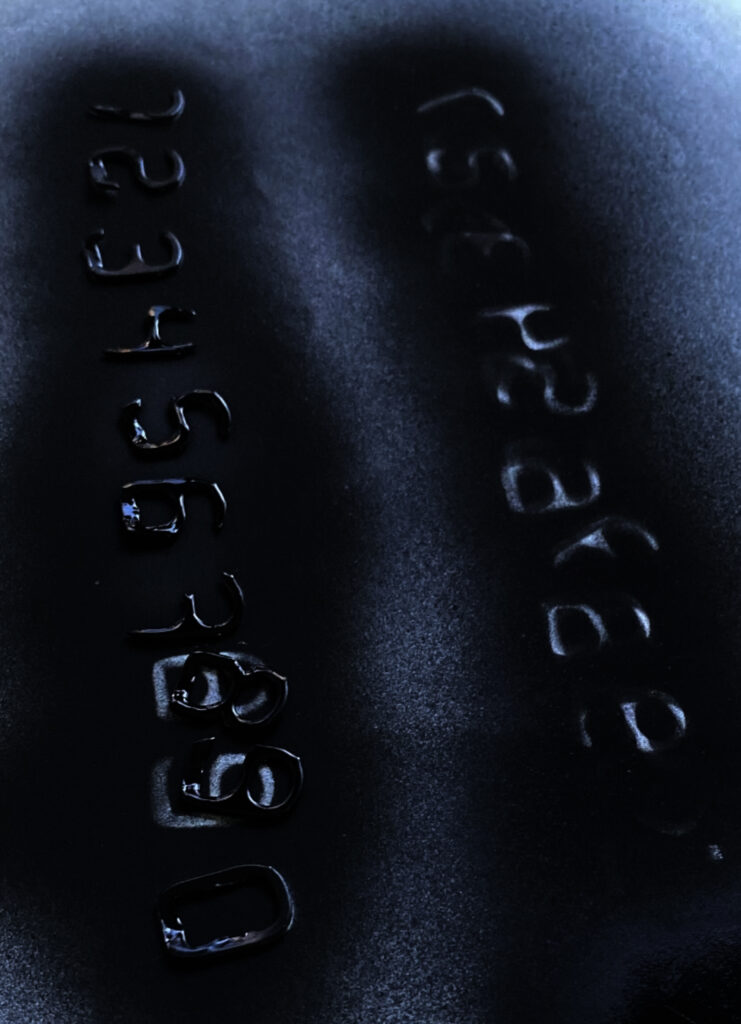
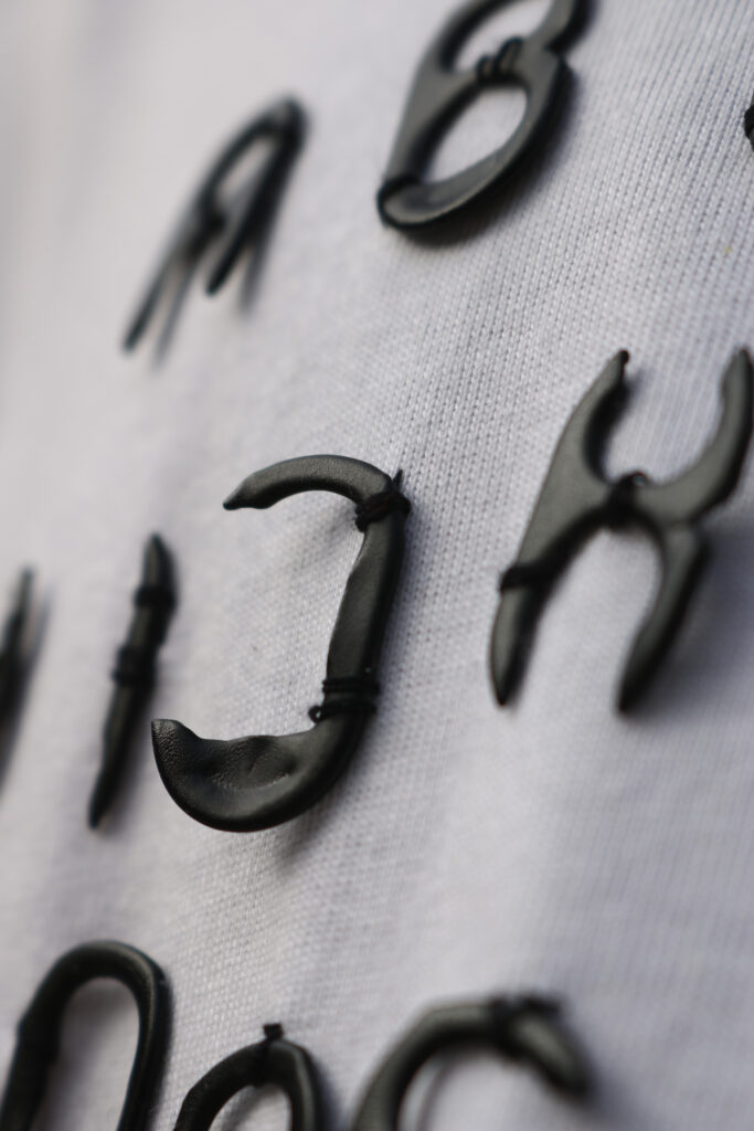
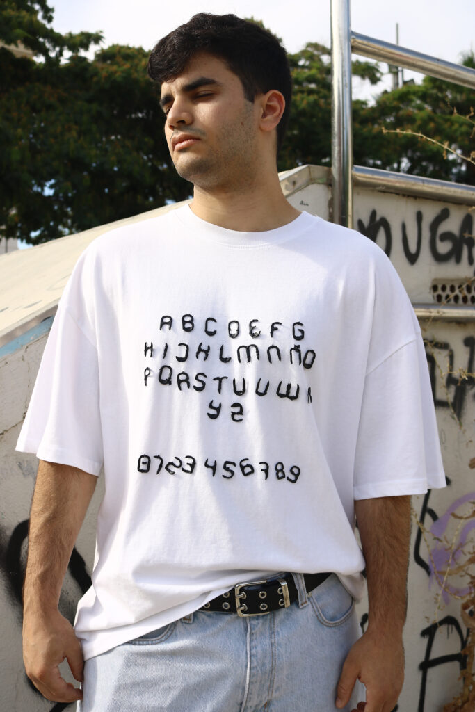
The process was entirely manual. I collected the lids with the help of classmates and teachers, then cut, sanded and painted them by hand. I then digitised each letter to build the typeface in Glyphs, paying close attention to spacing, proportions and visual consistency. As a complement, I designed a type specimen by sewing the metal letters onto a T-shirt, exploring their application in textile design as well.
With Chapa, I wanted to go beyond the purely graphic, combining the physical and the digital, the artisanal and the technical. For me, this project is about how we can reinterpret our surroundings with a creative eye, and about the value of working with our hands to give shape to new ideas.
More than just a typeface, Chapa is a small reflection on design, recycling and the expressive potential of the materials that surround us.