Barsinghausen Variable is a contemporary grotesque typeface born from a small village in northern Germany near Hanover. Rooted in personal heritage, this organic font pays tribute to a quiet regional identity shaped by water, landscape, and memory.
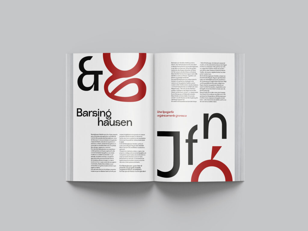
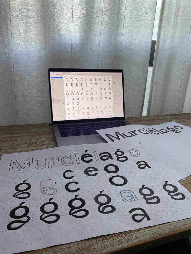
Formally, Barsinghausen blends typographic tradition with modern digital typography. Its unique inktraps revive historical printing legibility as a sleek aesthetic feature. Organic details—like the leaf-shaped counterform of the ‘a’ and the fluid curves of the ‘g’—subtly echo the region’s nature and rain.
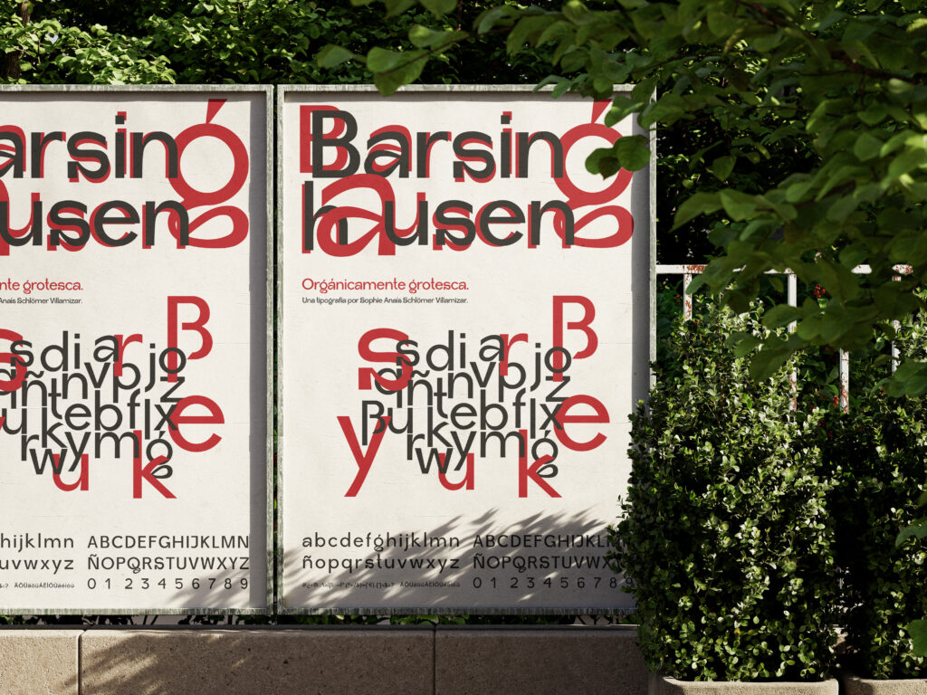
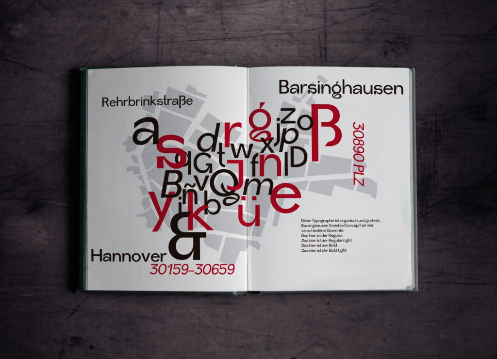
The versatile font family comprises four weights: Regular, Regular Italic, Bold, and Bold Italic. Presenting a high-contrast specimen in white, black, and red, the editorial design pairs typographic clarity with experimental composition against a regional map layout. Barsinghausen Variable proves that overlooked geographies deserve a distinct voice in contemporary type design.